Megadeth Marketing Flyer

Health_Hazard**

Administrator
Admin
This is a form of art, right?? :D Well, to me it is.

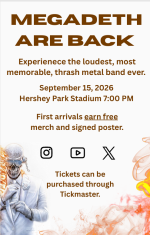
I'm currently in Marketing class, and it's not bad. A while ago, I had to do an assignment where I designed a flyer for a band and an event. (Not officially) Obviously, I went with Megadeth, which was good timing since the Hershey Park gig was coming up. I initially thought of going with a purple scheme (the color I associate with the band), but having a flyer look like the last album was more fitting. In the end, it was cool using one of my passions in my work!
 

Attachments

  • Screenshot 2026-09-22 155712.png
    Screenshot 2026-09-22 155712.png
    232.9 KB · Views: 4
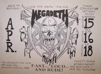
A lost art! No internet or other social media - just pure grassroot work, buidling a community and a band identity. The concert flyer were In some instances just as important as the album cover back then!

b178e02448878b4447bbc756af8932f1.jpg
 
A lost art! No internet or other social media - just pure grassroot work, buidling a community and a band identity. The concert flyer were In some instances just as important as the album cover back then!

View attachment 66
Absolutely! There's something charming about the early Megadeth promotion compared to the more polished advertisements that came afterward. I mentioned in an earlier thread that I prefer the first album cover of KIMB over the one used for the remaster, since it suited the tone of the album better, as the original mixing wasn't polished.
 
I mentioned in an earlier thread that I prefer the first album cover of KIMB over the one used for the remaster, since it suited the tone of the album better, as the original mixing wasn't polished.
Agree! I completely understand why Dave and the band hated it at the time. They wanted a professional presentation for their debut, especially compared to rivals who already had sleek albums out like Ride the Lightning. Having a label just throw something together last minute is a nightmare. But in hindsight, there is an absolute charm to that occult, gritty, low-budget photo. It perfectly captures the raw spirit and chaotic energy of underground thrash!
 
Agree! I completely understand why Dave and the band hated it at the time. They wanted a professional presentation for their debut, especially compared to rivals who already had sleek albums out like Ride the Lightning. Having a label just throw something together last minute is a nightmare. But in hindsight, there is an absolute charm to that occult, gritty, low-budget photo. It perfectly captures the raw spirit and chaotic energy of underground thrash!
And since then, there hasn't been an album that sounds anything like the debut! I also like how the logo was different, since it was a cool one off.
 
I also like how the logo was different, since it was a cool one off.
Yeah that is true! Even though the logo was just another messed up job by the label. Because of the tiny budget the designer just used rub-on letter stickers in a font called "English Tudor" and rubbed the bands name onto the page letter by letter (this was way before computers remember 😁)
 
Yeah that is true! Even though the logo was just another messed up job by the label. Because of the tiny budget the designer just used rub-on letter stickers in a font called "English Tudor" and rubbed the bands name onto the page letter by letter (this was way before computers remember 😁)
That makes sense. I've read somewhere that the original logo was based on another band's logo Dave saw (can't remember the name), but I found that a little strange. But the English Tudor font wasn't too bad, since the label could've resorted to a more generic font like Times New Roman. 😅
 
That makes sense. I've read somewhere that the original logo was based on another band's logo Dave saw (can't remember the name), but I found that a little strange. But the English Tudor font wasn't too bad, since the label could've resorted to a more generic font like Times New Roman. 😅
Oh yeah true - good thing that they did not end up with Times New Roman!

I haven't heard that rumour - by the orignal do you mean the VERY first crude logo and artwork? (post #4 in this thread)

I know that Dave has revealed that the definitive logo, as seen on Peace Sells, was inspired by the 1982 Conan the Barbarian movie poster. They even deliberately styled the logo in the same metallic, chiseled gold text.
 
I haven't heard that rumour - by the orignal do you mean the VERY first crude logo and artwork? (post #4 in this thread)

I know that Dave has revealed that the definitive logo, as seen on Peace Sells, was inspired by the 1982 Conan the Barbarian movie poster. They even deliberately styled the logo in the same metallic, chiseled gold text.
No. The logo used for the first album.
 
I haven't heard that rumour but a lot of underground bands in the early '80s were all using these very similar, off-the-shelf gothic styles. It was almost like the unversal logo style back then. Think like early Mercyful Fate, Venom, Motorhead etc.
Slightly off topic, but when James was designing the logo for Metallica, one of the earlier drafts in his notebook looked like Motorhead's logo. Which isn't surprising, but uniqueness is important to me. I don't mind modern metal, but I don't like how recent bands have similar logos that are unintelligible to read. At least it's not all of them, but still.
 

Attachments

  • shamrock-slaughter-2027-who-else-is-going-v0-yejjm6df7zth1.webp
    shamrock-slaughter-2027-who-else-is-going-v0-yejjm6df7zth1.webp
    495.4 KB · Views: 1
Agree! I completely understand why Dave and the band hated it at the time. They wanted a professional presentation for their debut, especially compared to rivals who already had sleek albums out like Ride the Lightning happymod. Having a label just throw something together last minute is a nightmare. But in hindsight, there is an absolute charm to that occult, gritty, low-budget photo. It perfectly captures the raw spirit and chaotic energy of underground thrash!
do you think Megadeth would have gotten as big as they did if they had stuck with that gritty, low-budget occult aesthetic instead of modernizing?
 
Back
Top